The Psychology Behind Fast Food Logos: Why Red and Yellow Dominate
Written by Rithika Narikimilli
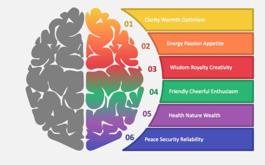
Fast food chains often use red and yellow in their branding, a deliberate strategy rooted in psychology, culture, and design. Red is dynamic and stimulating, grabbing attention, increasing heart rate, and triggering hunger. It conveys urgency, making it ideal for encouraging quick decisions in a fast-paced industry. Yellow complements red by evoking happiness, warmth, and optimism, creating a welcoming atmosphere that appeals to families and individuals alike.

Together, red and yellow form a powerful combination: red sparks excitement and appetite, while yellow fosters comfort and positivity. Their high contrast ensures visibility and memorability, even from a distance or in low light. Culturally, these colors symbolize joy and celebration, making them universally appealing and ideal for global brands.

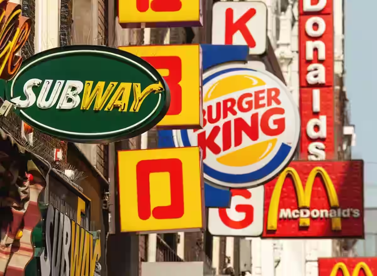
Practical design advantages further enhance their effectiveness. Red and yellow are highly visible, even in challenging conditions, and their boldness makes logos memorable. Iconic brands like McDonald’s, Burger King, and KFC have mastered this combination to create lasting impressions, proving how thoughtful design can drive success. The strategic use of these colors not only captures attention but also reinforces the fast food industry's values of speed, affordability, and mass appeal.

